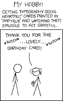
From xkcd, via B.
There was no intention to include the font in other applications other than those designed for children when I designed Comic Sans.
-Vincent Connare
So why did he do it? When Connare was still a font designer for Microsoft way-back-when, he designed Comic Sans for a program called Microsoft Bob. From the still of MS Bob on Connare's website, the program looks like some kind of creepy tour-de-stuff led by a dog presumably named Bob (the character calls to mind the dog that offered, without solicitation, help formatting your greetings in MS Word). The scorn held toward Comic Sans by the design community is matched only by the adoration held by the bake-sale community - and the latter, unfortunately, has more say in whether or not the font will persist in our visual culture. That is, unless programmers step in and remove it as an option from MS Word, Publisher, Movie Maker, etc, the idea of which being very exciting for two reasons: first, Comic Sans would be gone for good, and secondly, it would be fascinating to watch how the community of its users would handle the absence. What font would they find to take its place? Papyrus does come to mind (though its most frequent home is the covers of New Age literature). Probably not Connare's other big-name font, Trebuchet, which is certainly not whimsical and built-for-children enough to advertise Bunko night. On the other side, if they began using, say, Helvetica or Univers or Bodoni ~ any sacred typeface ~ the design community would simply have a new focus of impotent outrage. There doesn't seem to be a way through, and certainly not around this, ahem, comical dilemma.
The poetic part of all this is that the admirers of Comic Sans blissfully have no idea about the vast, lonely, Sisyphean world of designers that hold them in so much contempt. Point: admirers. But in the meantime, feel free to join the cause...
